
- About us
- Work
- Our process
- Blog
- Career
- QR Code Generator
- Password Generator
- JSON Formatter & Validator
- UUID/GUID Generator
- Base64 Encoder/Decoder
- Hash Generator
- JWT Decoder
- Unix Timestamp Converter
- URL Encoder/Decoder
- IP Address Lookup
- Color Picker & Converter
- Markdown Editor & Preview
- HTML Encoder/Decoder
- Text Diff Checker
- Invoice Generator
- Lorem Ipsum Generator
- Image Compressor
- Image Resizer
- Fake Data Generator
Menu
FareNow
COMPANY
FareNow
CATEGORY
Local Services Marketplace / On-Demand Service Platform
TIMELINES
Three months (Design, Development, Testing & Launch)
SERVICE WE PROVIDED
KEYWORDS
Share this Case Study:
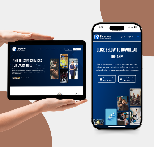
About the Project
FareNow is a versatile platform designed to connect users with a wide range of local service providers, including contractors, cleaners, landscapers, and more. The platform aims to simplify the process of finding reliable professionals by providing a centralized marketplace where users can browse, compare, and book services easily. FareNow emphasizes convenience, trust, and transparency, making it easier for homeowners and businesses to access quality local services on demand.
Requirements
The project required building a user-friendly platform that could list multiple service categories, allow service provider profiles, and support easy booking and communication. Users needed the ability to search and filter providers, view ratings and reviews, and schedule appointments. The system also had to include a backend capable of managing provider information, bookings, payments, and notifications while ensuring security and reliability.
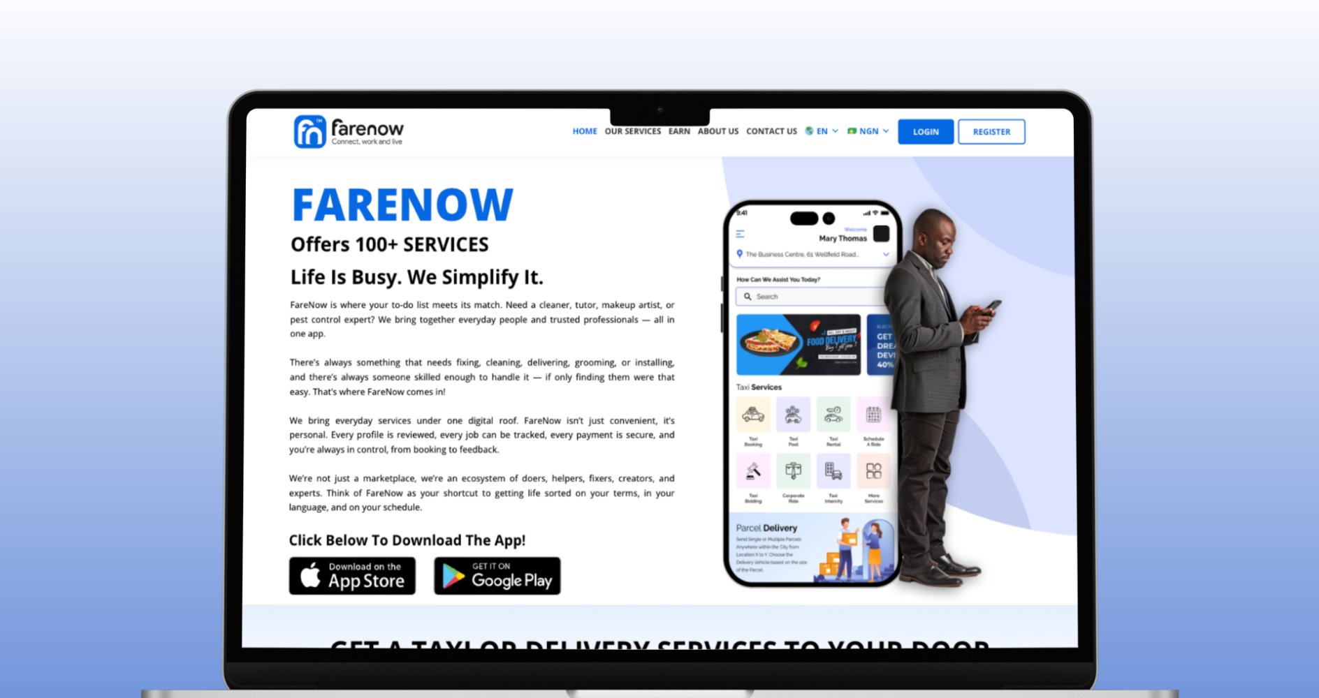
Solutions
To meet these requirements, a robust platform architecture was developed that organizes service categories, provider profiles, and user interactions seamlessly. A clean and intuitive interface allows users to quickly find the right service, book appointments, and leave feedback. The backend supports real-time booking updates, secure payment integration, and notifications to both users and providers. Advanced filtering and rating systems were implemented to help users make informed decisions efficiently.
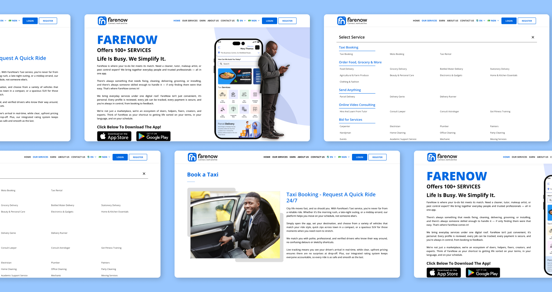
Design System
The design system focuses on simplicity, usability, and consistency. Components were created for service listings, provider profiles, booking flows, and notifications, ensuring a cohesive experience across all screens. Clear typography, intuitive icons, and responsive layouts make the platform easy to navigate on both desktop and mobile devices.
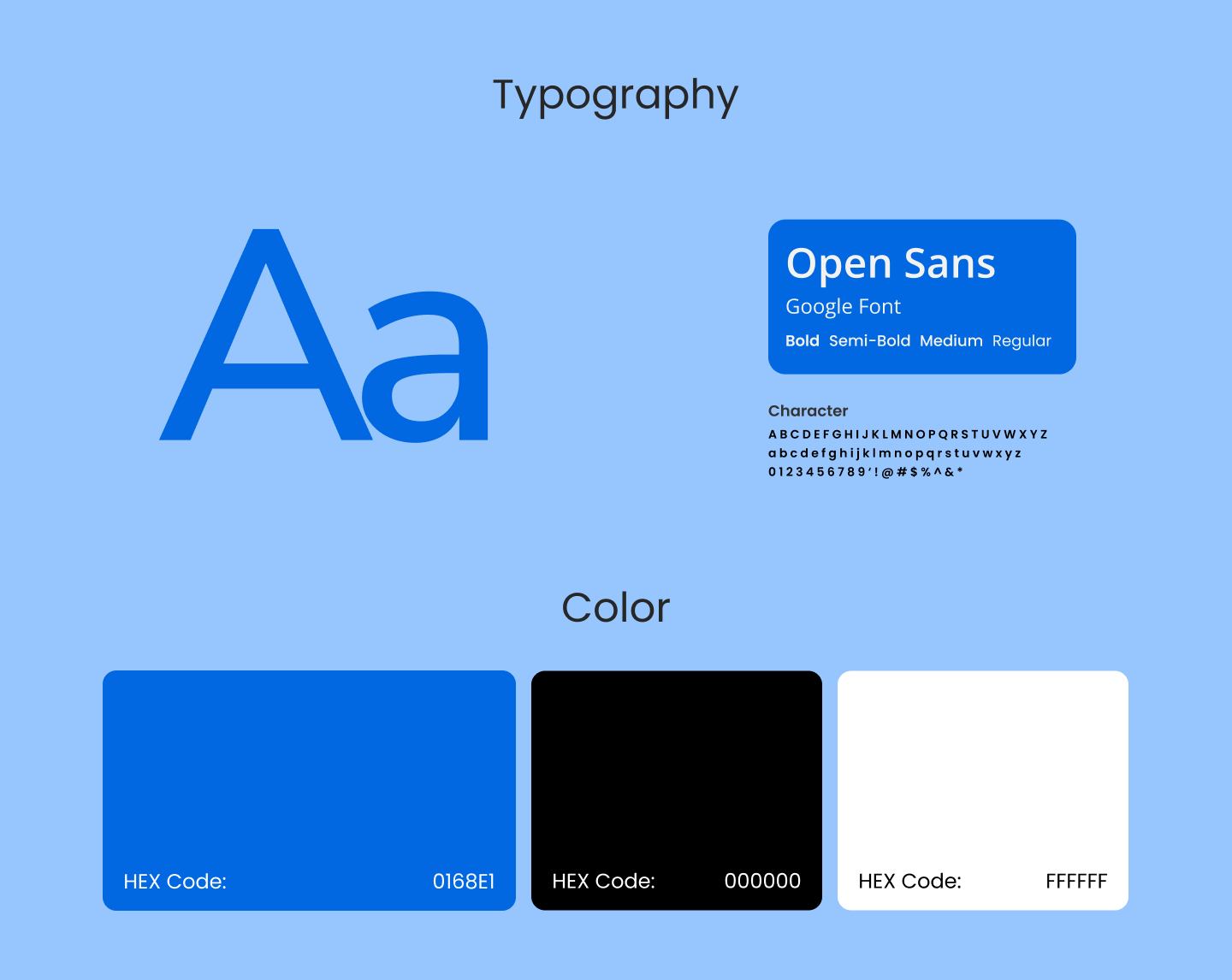
Color Palette
FareNow’s visual identity uses a primary teal to represent trust and reliability, complemented by vibrant accent colors for interactive elements such as buttons and highlights. Neutral background shades ensure readability and help key information, such as provider details and ratings, stand out clearly.
Have a great idea?
Have a great
idea?

We’ll assign a dedicated manager for you.
Inquiries
info@devxhub.com
Not Interested in submitting the form? Book A Call Directly
Company
- Services
- About us
- Our process
- Career
- Blog
- Schedule a Meeting
- Products
- Tools
See Company Profile

HIRE SPECIALIZED TALENT
Frontend Developer
Backend Developer
App Developer
MERN STACK Developer
Java Developer
.NET Core Developer
Software Architect
AI/ML Engineer
DevOps/Cloud Engineer


© 2026, Devxhub Limited, All Rights Reserved.
