
- About us
- Work
- Our process
- Blog
- Career
- QR Code Generator
- Password Generator
- JSON Formatter & Validator
- UUID/GUID Generator
- Base64 Encoder/Decoder
- Hash Generator
- JWT Decoder
- Unix Timestamp Converter
- URL Encoder/Decoder
- IP Address Lookup
- Color Picker & Converter
- Markdown Editor & Preview
- HTML Encoder/Decoder
- Text Diff Checker
- Invoice Generator
- Lorem Ipsum Generator
- Image Compressor
- Image Resizer
- Fake Data Generator
Menu
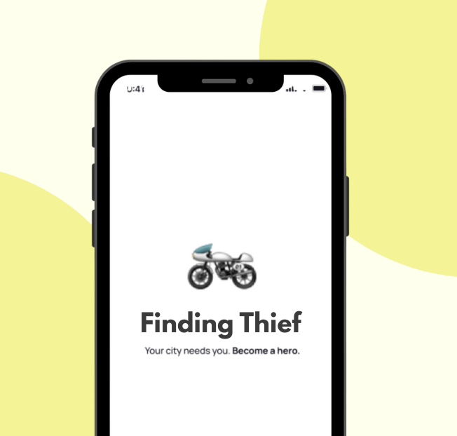
Finding Thief
COMPANY
Finding Thief
CATEGORY
Personal Safety App / Mobile Security Platform
TIMELINES
Three months (Design, Development & Testing)
SERVICE WE PROVIDED
KEYWORDS
Share this Case Study:
About the Project
Finding Thief is a mobile application developed to enhance personal safety by allowing users to mark unsafe zones and share their live location with trusted contacts. The app provides a proactive approach to safety, helping individuals avoid high-risk areas and alerting friends or family in case of emergencies. By combining real-time location tracking with crowd-sourced safety data, Finding Thief empowers users to navigate their surroundings with confidence and peace of mind.
Requirements
The project required a secure and responsive mobile application that could track users’ locations in real-time and allow them to mark unsafe zones. It needed to provide alerts to nearby contacts during potential threats and enable reporting of suspicious incidents. The app also required a clean and intuitive interface for marking zones, viewing safety maps, and managing trusted contacts efficiently. Security and privacy of user data were key requirements, alongside performance optimization for smooth real-time updates.
Solutions
To meet these requirements, a mobile app was developed with live location tracking, unsafe zone marking, and emergency alert notifications. Users can easily add and view unsafe zones on a map, and the app sends instant alerts to predefined contacts in case of danger. Backend systems were implemented to ensure fast, reliable data processing, while strong encryption and privacy measures protect sensitive user information. A user-friendly interface with interactive maps and simple navigation makes it easy for anyone to use the app effectively.
Design System
The design system prioritizes clarity, safety, and ease of use. Components for maps, alerts, notifications, and user profiles were standardized for consistency. Clean typography, intuitive icons, and organized layouts ensure that users can access key features quickly and react promptly in emergency situations.
Color Palette
The app uses red accents to indicate danger and alerts, complemented by neutral blues and grays for calmness and readability. Bright highlights draw attention to actionable items, while light backgrounds ensure map clarity and user focus.
Have a great idea?
Have a great
idea?

We’ll assign a dedicated manager for you.
Inquiries
info@devxhub.com
Not Interested in submitting the form? Book A Call Directly
Company
- Services
- About us
- Our process
- Career
- Blog
- Schedule a Meeting
- Products
- Tools
See Company Profile

HIRE SPECIALIZED TALENT
Frontend Developer
Backend Developer
App Developer
MERN STACK Developer
Java Developer
.NET Core Developer
Software Architect
AI/ML Engineer
DevOps/Cloud Engineer


© 2026, Devxhub Limited, All Rights Reserved.
